Showing posts with label graphs. Show all posts

Sunday, May 1, 2011

One of Krugman's talents

...is the ability to dig up or create a simple picture that effectively rebuts a popular but flawed narrative.

For example, take the profligate PIGS story -- the EU is in trouble mainly because four countries (Portugal, Ireland, Greece and Spain) were reckless spendthrifts. It's a widespread explanation. Edward Glaeser even used a Spain specific variant of it to argue against high-speed rail.

In response to this, Krugman shows us the debt levels and deficits of these four countries (plus Germany as a reference point) on the eve of crisis:


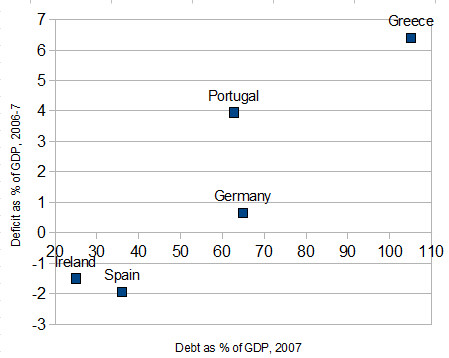
As Krugman summarizes:

Yes, Greece had big debts and deficit. Portugal had a significant deficit, but debt no higher than Germany. And Ireland and Spain, which were actually in surplus just before the crisis, appeared to be paragons of fiscal responsibility — the former, said George Osborne, was

a shining example of the art of the possible in long-term economic policymaking.

We know now that the apparent fiscal health of Ireland and Spain rested largely on housing bubbles — but that was by no means the official view at the time. And nothing I’ve seen explains how new fiscal rules would prevent a similar crisis from happening again.


Friday, April 23, 2010

"Any color you want as long as it's black"

Following up on Joseph's post, I have two points about SAS's graphics:

First, as bad as they are now, you should have seen them in the early Nineties;

Second, I think the graphics are a pretty good indication of the culture of SAS, a large, privately-held company with an effective monopoly over much of its market. SAS does good work and has an incredible record of innovation but is (in the words of some of its employees) a benevolent dictatorship. The company's attitude has always been we will decide what you need and what's a fair price for it.

I don't mean this as a slam against SAS. After almost twenty years you can put me down as a satisfied customer. It's a good company to work with and, by all accounts, a great company to work for. I don't think going public would make SAS a better company, but I do think it would make it do some things better.

SAS graphics

Okay, it is barely possible to make a decent looking SAS graphic with a half page of code, painfully specified to remove the abjectly painful default look. So imagine my susrpise when R and STATA do good looking graphics with a one line command. Sure, it might occasionally be a long line but still . . . Even EXCEL does this a lot better.

Why is SAS different?

It might seem like a minor point but there is a fair bit of truth to the idea that (easy to use) graphical represenations of data are extremely helpful.

The longer I work with SAS (since 1997) the more I wonder about this . . .