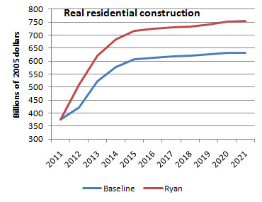
 I was listening to Talk of the Nation this evening (admittedly not NPR at its best or even second best) and I was struck by how different (and inferior) what I was hearing was to the wonk debate (Krugman, Thoma, Gelman, et al.). Journalists and pundits are arguing over whether Ryan is bold or extra bold while we should be arguing over the practicality and advisability of a recovery based on another housing boom.
Comments, observations and thoughts from two bloggers on applied statistics, higher education and epidemiology. Joseph is an associate professor. Mark is a professional statistician and former math teacher.
Thursday, April 7, 2011
Another interesting Ryan graph from Krugman
 I was listening to Talk of the Nation this evening (admittedly not NPR at its best or even second best) and I was struck by how different (and inferior) what I was hearing was to the wonk debate (Krugman, Thoma, Gelman, et al.). Journalists and pundits are arguing over whether Ryan is bold or extra bold while we should be arguing over the practicality and advisability of a recovery based on another housing boom.
Wednesday, April 6, 2011
Andrew Gelman buries the lede
Internal (probabilistic) vs. external (statistical) forecasts
In statistics we talk about two methods of forecasting. An internal forecast is based on a logical model that starts with assumptions and progresses forward to conclusions. To put it in the language of applied statistics: you take x, and you take assumptions about theta, and you take a model g(x,theta) and use it to forecast y. You don't need any data y at all to make this forecast! You might use past y's to fit the model and estimate the thetas and test g, but you don't have to.
In contrast, an external forecast uses past values of x and y to forecast future y. Pure statistics, no substantive knowledge. That's too bad, put the plus side is that it's grounded in data.
A famous example is the space shuttle crash in 1986. Internal models predicted a very low probability of failure (of course! otherwise they wouldn't have sent that teacher along on the mission). Simple external models said that in about 100 previous launches, 2 had failed, yielding a simple estimate of 2%.
We have argued, in the context of election forecasting, that the best approach is to combine internal and external approaches.
Based on the plausibility analysis above, the Beach et al. forecast seems to me to be purely internal. It's great that they're using real economic knowledge, but as a statistician I can see what happens whey your forecast is not grounded in the data. Short-term, I suggest they calibrate their forecasts by applying them to old data to forecast the past (this is the usual approach). Long-term, I suggest they study the problems with their forecasts and use these flaws to improve their model.
When a model makes bad predictions, that's an opportunity to do better.
All too often, we treat models like the ancient Greeks might have treated the Oracle of Delphi, an ultimate and unknowable authority. If we're going to use models in our debates, we also need to talk about where they come from, what assumptions go into them, how range-of-data concerns might affect them.
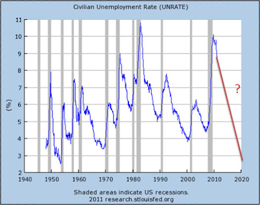
Unemployment Forecasting
If a study shows that the use of statin class drugs prevents cancer that is a pretty interesting finding. But the finding gets less interesting if further exploration reveals that statins prevent all forms of disease except for cardiovascular disease. The latter would be a clue that something, somewhere, is going wrong.
In the case of the Paul Ryan budget, it seems like this estimate of unemployment is lower than it should plausibly be which might obfuscate the idea trade-off between taxes and economic growth. I am not an economist (in any way, shape or form) but am willing to conjecture that his dynamic scoring algorithm for the influence of tax cuts on unemployment might be an issue. Perhaps the algorithm should account for diminishing returns as unemployment falls (but fails to do so properly). Or maybe the model overstates the magnitude of the underlying relation (or, possibly, it might reverse it). Complex models have a lot moving parts and there are a lot of places that bias can be introduced into them. So it’s important to be critical (of both our own work and the work of others) when we try and do this type of difficult forecasting.
The way some people talked in 1930
A few more quick thoughts before the Maltese Falcon goes back to the library. I've always been impressed by how much John Huston was able to get past the Hays office but the novel is far more frank. I'm no authority on the literature of the era but it seems ways ahead of its time.
Tuesday, April 5, 2011
Why I still drop by Krugman's blog once or twice a week

These are, of course, the same people who predicted the Clinton tax hikes would trigger a devastating recession.
It's that sub-advisement you really have to worry about
“For internally-managed Funds advised and sub-advised exclusively by John Hancock’s affiliates, the total fees John Hancock and its affiliates receive from these Funds may be higher than those advised or sub-advised exclusively by unaffiliated mutual fund companies. These fees can come from the Fund or trust’s Rule 12b-1, sub-transfer agency, management, AMC or other fees, and may vary from Fund to Fund.”
Brad DeLong digs through the NYT archives for this memorable rebuttal of Charles Murray
The book shows that, on average, blacks score about 15 points lower than whites on intelligence tests, a point that was widely known and has not been in dispute. Mr. Murray and I (and many, many others) differ on the reasons for the disparity. I would argue that a group that was enslaved until little more than a century ago; that has long been subjected to the most brutal, often murderous, oppression; that has been deprived of competent, sympathetic political representation; that has most often had to live in the hideous physical conditions that are the hallmark of abject poverty; that has tried its best to survive with little or no prenatal care, and with inadequate health care and nutrition; that has been segregated and ghettoized in communities that were then redlined by banks and insurance companies and otherwise shunned by business and industry; that has been systematically frozen out of the job market; that has in large measure been deliberately deprived of a reasonably decent education; that has been forced to cope with the humiliation of being treated always as inferior, even by imbeciles -- I would argue that these are factors that just might contribute to a certain amount of social pathology and to a slippage in intelligence test scores.Mr. Murray says no. His book strongly suggests that the disparity is inherent, genetic, and there is little to be done about it....
The last time I checked, both the Protestants and the Catholics in Northern Ireland were white. And yet the Catholics, with their legacy of discrimination, grade out about 15 points lower on I.Q. tests...
Fixing performance pay
"Many accountability and performance pay systems employ test scores from assessment systems that produce information used not only to determine rewards and punishments for educators, but also to inform the public about progress in student learning," Neal writes in the paper, "The Design of Performance Pay in Education."I'm not sure I'm in full agreement here. For one thing, the problems with our current methods for evaluating student progress are deeply flawed even when not asked to do double duty. Second, in my experience, most of the pressure to inflate scores comes from above. As long as test scores affect the fortunes of administrators, the less ethical superintendents and principals will find a way to influence teachers (even without the option of dismissal, a principal can make a teacher's life very tough).
These testing systems make it easy, in theory, for policymakers to obtain consistent measures of student and teacher performance over time. But Neal argues that the same testing regimes also make it easy, in practice, for educators to game incentive systems by coaching students for exams rather than teaching them to master subject matter.
"As long as education authorities keep trying to accomplish both of these tasks (measurement and incentive provisions) with one set of assessments, they will continue to fail at both tasks," he adds in the paper, which was published by the National Bureau of Economic Research and is a chapter in the upcoming Handbook of Economics of Education.
...
Separate assessment systems that involve no stakes for teachers, and thus no incentives for manipulation, should be used to produce measures of student performance over time, Neal contends. This two-system approach would discourage excessive "teaching to the test."
"The designers of assessment-based incentive schemes must take seriously the challenge of designing a series of assessments such that the best response of educators is not to coach, but to teach in ways that build true mastering," Neal said.
Just to be clear, almost all of the administrators I've worked have been dedicated and ethical but I can think of at least one guy, two time zones and two decades from here and now, who managed to pressure a number of tenured but spineless teachers into spending weeks doing nothing but prepping for standardized tests.
What we need is a more comprehensive and better thought out system for measuring student progress.
Monday, April 4, 2011
It's possible that statisticians have an odd definition of 'interesting'
Two recent price comparisons of grocery and household goods revealed that Target's prices are lower than at No. 1 retailer Wal-Mart.Though I don't have enough information to say for sure, the CGP study looks pretty solid (particularly compared to some of the research I've seen from other consultants) and it's backed by additional analysis and a separate study.
Craig Johnson, president of retail consulting firm Customer Growth Partners, compared 35 brand-name items sold at Wal-Mart and Target stores in New York, Indiana and North Carolina. They consisted of 22 common grocery goods such as milk, cereal and rice; 10 general merchandise products such as clothing and home furnishings; and three health and beauty items.
Target's shopping cart rang in at $269.13 (pre-tax), a hair lower than the $271.07 charged at Wal-Mart.
"For the first time in four years, our price comparisons between the two has shown that Target has a slight edge over Wal-Mart," said Johnson. A smaller study by Kantar Retail found similar results.
What really stands out for me, however, is the slipperiness of assigning even a well-designed metric to something like the cost of shopping at a certain store. In order to get these results you have to buy the same brands of the same items in the same quantities as those in the studies. Your own shopping list would certainly produce different results (though the difference probably wouldn't be all that large).
It's always useful to remember that metrics are, with few exceptions, arbitrary. They may be useful and well thought-out but they should be approached with that caveat in mind.
Denominators
The article also explicitly discusses the fact, previously discussed on this blog, that it's misleading, to the point of being wrong in most contexts, to compare the safety of walking vs cycling vs driving by looking at the casualty or fatality rate per kilometer. Often, as in this article, the question of interest is something like, if more people switched from driving to cycling, how many more or fewer people would die? Obviously, if people give up their cars, they will travel a lot fewer kilometers! According to the article, in Denmark in 1992 (!), cycling was about 3x as dangerous per kilometer as driving, but was essentially equally safe per hour and somewhat safer per trip.
Transportation safety is a tricky thing and it only gets trickier as you try to define the best possible measure of risk. However, it is worth noting that when results vary as widely as cycling does based on the selection of the denominator then it is worth reporting all of the possible metrics. Otherwise, the person presenting the data is makign a decision as to what is the most relevant comparison.
For example, opponents of urban density may see commuting distances as inflexible and be interested in the risk per mile. On the other hand, advocates for cycling may well point out that the decision to cycle may feed into the decision of where to live.
But it is a good point to remember just how easily convincing measures of association can be misleading.
Sunday, April 3, 2011
Weekend Thriller Blogging -- the Maltese Falcon
Before starting Gores' novel I decided to go back and reread the original. It's not Hammett's best book. That would either be Red Harvest* or the collected Continental Op stories, but Falcon is still very good and it offers an almost unique experience for the reader.
The Maltese Falcon and Shane are the only two cases I can think of where strong, well-written, enjoyable novels were made, with almost complete fidelity, into great, iconic films. To read these books is to be pleasantly overwhelmed by memories of the movies they inspired.**
There is almost a one-to-one mapping of page to screen. This is only possible because both are short novels. Each comes in under two hundred pages. Most otherwise faithful adaptations either have to add material (The Man Who Would Be King) or leave large parts out (The Silence of the Lambs). Almost everything you read in the Maltese Falcon is associated with some unforgettable image.
There is one deviation worth noting. As Pauline Kael pointed out, Effie's reaction to Spade at the end of the book is significant, highlighting aspects of the characters we might have tried to overlook. It is an important difference from the movie but by the time you get to it you're so immersed in the experience, it's almost like seeing a deleted scene.
*I was tempted to mention Yojimbo here but that's a fight for another post.***
** I realize some of you have another set of films to add to this list, but I never made it past Fellowship, so I'll just have to take your word for it.
*** If I do post on Red Harvest and Yojimbo, remind me to toss Savage Range into the discussion
At least we can still drink and drive
Saturday, April 2, 2011
Press-release journalism and the NYT's lost default setting
Microsoft Accusing Google of Antitrust Violations - NYTimes.com
Most shorter news stories, particularly those based on press conferences, released statements or other publicly available information, are pretty much interchangeable with respect to provider. The version you get from the New York Times will be essentially identical to the ones from the Washington Post or the LA Times or NPR or any other major outlet.
The New York Times traditionally got a disproportionate share of the traffic for these stories because it had become something of a default setting. This traffic meant increased ad revenue. Perhaps more importantly, it brought people into the site where they could be introduced to other, less interchangeable features (for example, the film reviews of A.O. Scott or the columns of Frank Rich). These features are the basis of a loyal readership.
I'm sure that the models Sulzberger and company are using take into account the fact that traffic will drop when you put the paywall into effect. Having worked on some major corporate initiatives, I can tell you that is not the sort of thing that is likely to be omitted. What is, however, often left out is the necessary disaggregation. For example, even in well-run Fortune-500 businesses, you will often run across analyses that correctly predict that a change will cause a net gain of ten percent of market share but fail to note that most of the established customers you will lose are highly profitable while most of those you're going to gain aren't worth having.
