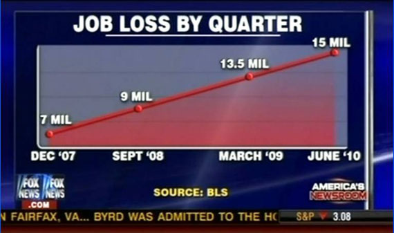
Darrell Huff had a witty explanation of how you can change the impression a graph gives by playing around with the scale and range of the y-axis, but even in a book called
How to Lie with Statistics he never even considered changing just
part of the scale of an axis. Of course, Huff was limited by the fact that his book was based on real statistical lies and screw-ups that he had found in the popular press as of the early Fifties. He also tried to limit himself to lies that were at least true in some technical sense. There was no way he could have anticipated Fox News.
The catch comes from
Media Matters via
Mark Thoma.

Here is the same graph with vertical lines for full comic effect.

Go ahead, measure them for yourself. It's fun.
In all fairness to Fox, the period from September '08 to March '09 did
feel like a long time.


It is also fascinating that the label of the graph is "by quarter" (big print) while the dates are not in quarters at all making it easy to misunderstand the time scale (not to mention the odd non-linearity of the x-axis).
ReplyDeleteVery poorly constructed graphic.
If Fox News says the sun is shining and I look out the window and the sun is actually shining I still assume they are lying
ReplyDeleteGreat find! Thank you!
ReplyDelete